Fiore di Nonno
Project Summary
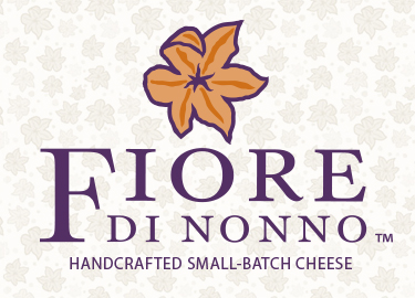
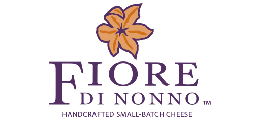
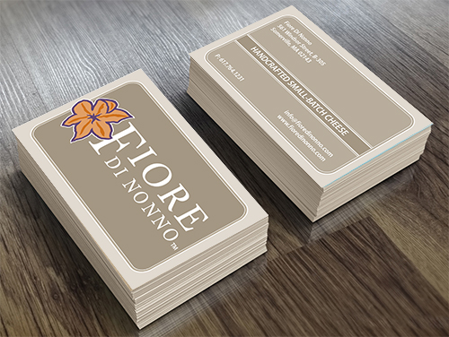
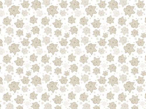
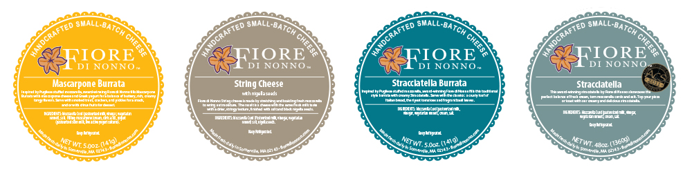
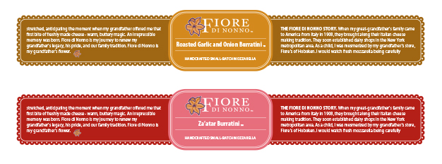
The Vertetude team has worked with the founder of Fiore di Nonno to update the company logo, packaging, literature, and ads. The lightness of fresh dairy, the “Fiore flower” mark, and the unique ingredient combinations of the flavored burratas provided key design elements for the packaging design.
Jump to:
Branding
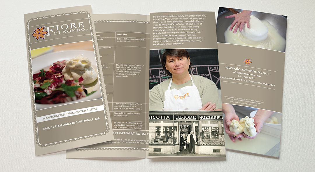
Collateral
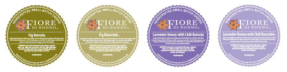
Packaging
Branding
Owner and artisan cheese maker, Lourdes Smith, created a brand name that incorporates the family name, Fiore, as a tribute to her family’s cheesemaking legacy. Fiore di Nonno, “flower of my grandfather”, also references a signature product, Fior di latte, a hand-crafted mozzarella. The graphics represent a fresh take on the heritage of hand-crafted cheesemaking.
Packaging
Creamy white letters against colorful backgrounds, inspired by the flavor range of filled burratas, help identify and distinguish Fiore di Nonno’s unique product line with pleasing appetite appeal.
View More Projects